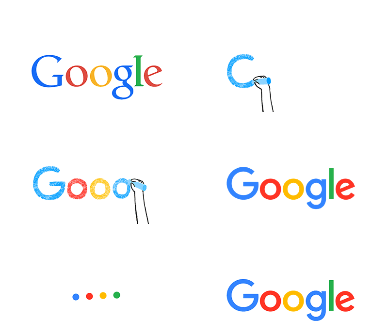
Yesterday, Google unveiled their new logo, created to usher in its rebranding as super-company Alphabet. The company announced last month that Google would become the largest subsidiary of Alphabet but, with the launch of the new logo, it seems that Google has now begun to really push the news out into the public domain.

Under Alphabet, Google will take on a more ‘slimmed down’ look, retaining YouTube, search and most of the bigger divisions while other operations such as drones, Google Fiber and venture capital investments will become separate companies under the Alphabet umbrella. The surprise news broke last month in a blog post from Google co-founders, Larry Page and Sergey Brin. Even though the blog post was made after the stock markets closed, shares in Google (which will still operate under the stock symbols GOOG and GOOGL) soared almost 6% in afterhours trading.
Page and Brin announced that the company’s management and structure will undergo a serious shake-up, with control of Google being handed over to former product chief, Sundar Pichai. Co-founders Page and Brin will become the C.E.O and President of Alphabet, presiding over all of the component companies, of which Google is the largest. Speaking of the radical changes, Page said ‘We’ve long believed that over time companies tend to get comfortable doing the same thing, just making incremental changes but in the technology industry, where revolutionary ideas drive the next big growth areas, you need to be a bit uncomfortable to stay relevant.’ The founders have definitely made some uncomfortable decisions in the past, with bold choices to fund innovative new inventions such as smart household devices, autonomous cars and state of the art medical research. The major restructuring under Alphabet will mean that investors now receive greater insight into how money is being spent, as Google’s financial results will be broken down separately from its brother and sister companies in the Alphabet umbrella.
After last month’s announcement, Google seems to be pushing forward with the rebranding, with the launch of its brand new, alphabet inspired logo yesterday. The new typeface (‘Product Sans’) is made to resemble a child’s school-book print and will replace the typeface that Google has been using in its logo for more than 16 years. The ‘e’ in Google will remain slightly askew to reflect Google’s ‘off-kilter’ thinking. Although this will be the sixth time the Google logo has changed since the company’s launch, it does mark the most radical change in appearance.
Alphabet has yet to reveal its logo but does have a dedicated webpage – https://abc.xyz/ – in which Larry Page explains the concept and aims of the new corporation, announcing ‘As Sergey and I wrote in the original founders letter 11 years ago, “Google is not a conventional company. We do not intend to become one.”’
Written for Digital Pie
